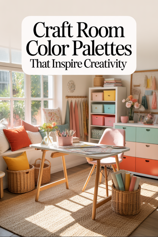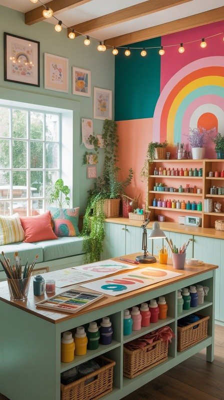
Introduction: The Role of Color in Your Craftroom
In the first part of this craft room makeover series, we focused on getting to know your space — assessing how you’ll use it, what storage and lighting you need, and how to make the most of your layout. That step was all about function and flow: understanding the bones of your craft room so it can truly work for you.
Now it’s time for the part that feels a little more magical — bringing your space to life with color. The colors you choose set the emotional tone for your creative corner. They can make you feel energized and ready to dive into a new project, or calm and centered for slow, mindful crafting sessions.
Color is more than just paint or pretty accents — it’s one of the most powerful design tools you have. It can influence focus, spark joy, and even help you find your creative rhythm. Whether your dream craft room feels like a burst of sunshine, a serene pastel retreat, or a modern mix of neutrals with pops of bold color, the right palette will make it unmistakably yours.
In this part, we’ll walk through how to choose a color palette that inspires creativity — from identifying the mood you want to create, to pulling inspiration from your home and testing your ideas in real light. By the end, you’ll have a color story that not only looks beautiful but also supports your creative flow every time you walk into the room.
Step 1: Identify the Mood You Want to Create
Before you start pulling paint chips or scrolling Pinterest boards, pause for a moment and imagine how you want your craft room to feel. This step is less about design rules and more about emotion — it’s about creating an atmosphere that supports your creativity and the way you like to work.
Ask yourself: when you walk into your dream craft room, do you want to feel energized and inspired, or calm and focused? Maybe you want a space that feels cozy and comforting, like a creative cocoon where you can unwind after a long day. There’s no right answer — the best palette is the one that reflects your creative personality.

Color plays a big role in setting that mood. Here’s a quick guide to how different tones can shape your experience:
- Warm tones (yellow, coral, peach, soft orange): Bring a boost of energy and playfulness. Perfect if you want your craft room to feel sunny and uplifting — great for brainstorming, painting, or working on colorful projects.
- Cool tones (mint, aqua, lavender, soft blue): Calm and restorative, ideal for sewing, journaling, or any craft that requires focus and patience.
- Neutrals (white, cream, beige, soft gray): Create a clean, versatile backdrop that lets your supplies and projects take center stage. Neutrals are great if you like to change your color accents often.
- Earthy tones (terracotta, sage, clay, ochre): Grounding and cozy — they make a room feel connected to nature and timeless in style.
Try writing a short “mood statement” to guide your choices, like:
“I want my craft room to feel bright, joyful, and organized — a space that sparks creativity but still feels peaceful.”
Once you have that guiding phrase, every color decision becomes easier. It’s your North Star — helping you choose shades that not only look beautiful but feel right every time you sit down to create.
Step 2: Take Cues from Your Existing Decor
Your craft room doesn’t have to exist in isolation — it can connect beautifully with the rest of your home’s style. Taking inspiration from your existing décor not only helps your space feel cohesive, but it also ensures your craft room feels like a natural extension of your home rather than an afterthought.
Start by looking around at the rooms nearby. What colors or materials do you already love in your home? Maybe your living room has warm wood tones and soft terracotta accents, or your kitchen leans toward airy whites and touches of sage green. Those hints can help you build a palette that feels harmonious from room to room.
If you prefer a seamless flow, echo one or two key tones from your existing décor — perhaps the same creamy base color or a coordinating accent shade. This approach creates visual continuity, so your craft room feels connected yet still distinct.
On the other hand, if you’d rather make your craft room a creative escape, don’t be afraid to branch out. You might keep one familiar color to tie it in (like your favorite soft neutral or metallic tone) but introduce something fresh — maybe pastel peach walls with mint storage bins or a cheerful wallpaper that makes you smile every time you see it.
Pro tip: Snap a few photos of the spaces near your craft room and look at them together on your phone screen. You’ll instantly see which colors repeat naturally — and where you might want to add contrast for a more dynamic, inspiring feel.
By anchoring your choices to what already feels like “home,” you’ll create a color palette that’s both creative and cohesive — a space that fits right in with your style while still celebrating your individuality.
Step 3: Find Your Inspiration Sources
Now that you have a sense of the mood you want and how your craft room connects to the rest of your home, it’s time to gather inspiration. This is the fun part — the stage where you get to dream, explore, and let your imagination wander a little.
Start by collecting visuals that spark something in you. Scroll through Pinterest, flip through magazines, or snap photos of things that catch your eye — anything from a patterned notebook to a sunset, a favorite scarf, or even a ceramic mug with the perfect glaze color. Sometimes the most inspiring palettes come from unexpected places.
Create a mood board (digital or physical) where you can start pulling everything together. Don’t worry about whether the colors “match” just yet — this step is about seeing patterns. After you’ve gathered a good mix, look for common threads.
- Are you drawn to soft pastels or bold jewel tones?
- Do your favorite images lean warm or cool?
- Is there a color that keeps showing up without you realizing it?
You’ll often find that your natural preferences reveal themselves through repetition.
To make it even more tactile, try building a small inspiration box with fabric swatches, paint chips, or craft paper in your favorite shades. Lay them out together in natural light to see how they interact. This can be especially helpful if you’re choosing colors for a real-life space, not just a digital board.
And remember, inspiration doesn’t have to come only from design sources. Look to your creative hobbies — your yarn stash, watercolor palette, or a handmade quilt might already contain a perfect color combination. The things you love creating often reflect the colors that make you happiest.
By the end of this step, you’ll have a curated collection of images, textures, and tones that feel distinctly you. It’s the foundation for building a color story that reflects your personality — and it will make the next step, choosing your main palette, feel intuitive and exciting.
Step 4: Choose a Base, Accent, and Pop Color
Now that you’ve gathered inspiration and identified your favorite hues, it’s time to translate those ideas into a cohesive palette you can actually use in your space. The easiest way to do this is by breaking your palette into three roles: base, accent, and pop colors.
Think of it like designing an outfit — your base color is the timeless piece, your accent adds style, and your pop color is the fun accessory that gives the look personality.
1. Base Color (about 60%)
This is your main color — the one that sets the overall tone for the room. It’s usually what you’ll use on your walls, large furniture pieces, or flooring.
- If you want a bright, open feel, try a soft white, warm cream, or very pale gray.
- For cozy warmth, consider blush beige, pale peach, or a whisper of terracotta.
- Want something soothing? Light sage, powder blue, or misty lavender can work beautifully.
Your base color should feel timeless and calming — it’s the backdrop for all the creative energy you’ll bring into the room.
2. Accent Color (about 30%)
Your accent color adds personality and definition. This is where you can layer in a bit of depth — think storage bins, shelving, a rug, or curtains.
- If your base is light, your accent might be mid-tone: soft teal, clay, or warm caramel.
- If your base is neutral, this is where you can introduce color while keeping things balanced.
Accent colors can help “zone” your space — for example, using one tone for your work area and another for your reading nook.
3. Pop Color (about 10%)
This is your creative spark — the shade that makes the room come alive. Pops work best in small doses, like on a chair, picture frame, or a few decorative jars on your shelves.
- Try coral with mint, mustard with sky blue, or hot pink with soft gray.
- Or pick a color from your craft materials that always makes you smile — it’s a great way to tie your personality directly into your décor.
If you’re hesitant about using bold colors on walls, start with a neutral base and layer your accents and pops through easily changeable décor: throw pillows, paint-dipped jars, framed art, or a patterned bulletin board.
A good rule of thumb is the 60-30-10 rule — 60% base, 30% accent, 10% pop — to keep things visually balanced and cohesive.
Once you’ve narrowed your choices, create a small flat lay or digital palette preview. Seeing your chosen colors side by side will help you visualize how they’ll flow together in real life — and make sure your space feels inspiring, not overwhelming.
Step 5: Test Before You Commit
Before you dive in with a paint roller or order a dozen storage bins, take a little time to live with your colors first. Testing your palette in real light is one of the most important (and often overlooked) steps in creating a space you’ll truly love.
Colors can shift dramatically depending on lighting, wall texture, and surrounding tones. That beautiful blush you loved online might look peachy in morning light or almost beige at night — and a calm gray can suddenly turn blue once it’s on your wall.
Start with paint samples — either peel-and-stick versions or small paint pots — and apply generous swatches on multiple walls. Look at them throughout the day: morning light, afternoon brightness, and evening lamplight. Notice how the color makes you feel in each setting. Does it stay soothing and inspiring, or does it start to feel too dark or cool?
For smaller décor elements, create mini mockups. Tape fabric swatches, scrapbook paper, or colored storage containers together on a table or pinboard to see how your accent and pop colors interact. Step back and take a photo — sometimes looking at your palette on-screen helps you spot balance or contrast issues more easily.
If you’re working in a multi-use room (say, a guest room that doubles as a craft space), pay attention to how your palette behaves with existing furniture and finishes. You might find that adjusting the undertone — a creamier white instead of a crisp one, or a warmer blue instead of a cool teal — helps everything blend more harmoniously.
This stage is your creative dress rehearsal. You’re testing how your ideas look and feel before fully committing, which saves time, money, and frustration later. When you finally settle on the right shades, you’ll know it — the palette will just “click,” and your space will start to feel like a place where ideas come alive.
Step 6: Add Texture and Pattern for Depth
Even the most beautiful color palette can fall flat without a little texture and pattern to bring it to life. Once you’ve tested and confirmed your colors, it’s time to layer in materials that add warmth, personality, and dimension — the secret ingredients that make your craft room feel lived-in and inspiring.
Think of texture as a way to make your colors more interesting. A smooth painted wall paired with a woven storage basket or a soft throw blanket creates contrast that keeps your eye moving. Try mixing materials like:
- Natural textures: rattan, jute, wood, or cork for warmth and a touch of organic coziness.
- Glossy finishes: lacquered trays, ceramic jars, or a painted metal chair for a polished pop.
- Soft textiles: curtains, cushions, or a cozy rug to balance harder surfaces and bring comfort.
These little shifts in texture help even a monochromatic palette feel layered and dynamic — perfect if you prefer a calm, neutral space but still want visual interest.
Now let’s talk pattern. Patterns introduce rhythm and personality. You can go subtle, like a soft floral wallpaper or geometric rug, or bold with a statement wall or colorful fabric storage bins. The key is to repeat at least one tone from your main palette so everything ties together.
If you’re nervous about mixing patterns, keep the scale varied — a large print wallpaper paired with smaller-scale stripes or dots, for example. This keeps things visually balanced rather than busy.
And don’t forget your craft supplies themselves! Yarn, ribbons, paint tubes, and paper stacks naturally bring in pops of color and texture — you can even display them intentionally as part of your décor. Clear jars of buttons or a neatly arranged pegboard of tools can double as both functional storage and cheerful decoration.
By thoughtfully layering texture and pattern, you’ll transform your color palette from flat to fabulous. Your craft room will feel richer, cozier, and full of personality — like a creative studio that truly reflects you.
Step 7: Keep Flexibility for Evolving Projects
One of the best things about a craft room is that it’s never truly finished — it evolves as your creative interests grow. The color palette you love today might shift as you discover new hobbies, seasons change, or you simply crave a fresh burst of inspiration. Designing your space with flexibility in mind makes it easy to adapt without starting from scratch.
Start with a versatile base — think soft neutrals, gentle pastels, or muted earth tones for walls and larger furniture pieces. These act like a blank canvas, allowing you to swap out accents and décor whenever you want a new vibe.
Then, bring your color story to life through changeable elements:
- Textiles like curtains, rugs, and throw pillows can instantly shift the feel of your space.
- Art and wall décor are perfect for introducing new hues or seasonal themes.
- Storage accessories — bins, jars, baskets — are easy (and fun) to rotate in different colors or materials.
If you’re someone who likes experimenting, consider removable wallpaper or peel-and-stick decals for a playful accent wall. They let you change things up without a long-term commitment. You can even keep a “color swap box” of accessories or small décor items to rotate when you’re ready for a refresh.
And remember: your craft room doesn’t have to look perfect all the time. It’s a working space, full of evolving projects and creative messes — and that’s part of its charm. The goal isn’t to freeze it in one perfect aesthetic but to make it a place that continues to inspire you.
By keeping your foundation flexible and your accents interchangeable, your space will always feel fresh, personal, and perfectly in sync with where you are in your creative journey.
Conclusion: Let Your Colors Tell Your Creative Story
Choosing your color palette is one of the most joyful parts of designing your craft room — it’s where function meets feeling, and your personality starts to shine through. By now, you’ve explored how to define the mood you want, draw inspiration from your home, and build a palette that feels cohesive, layered, and alive.
Your colors don’t just fill the space — they tell your creative story. They set the mood for every project you dream up, whether you’re working on something playful and bright or soft and serene. Most importantly, your palette should make you feel good the moment you step into the room.
As you experiment and refine, remember that your craft room is a living, breathing space that can evolve with you. Don’t be afraid to trust your instincts and let your choices reflect your unique spark — even if that means mixing a few unexpected shades.
In the next post in this series, we’ll move from color to lighting and layout — exploring how to make your craft room not just beautiful, but also brilliantly functional. You’ll learn how to use natural and artificial light to your advantage, arrange your space for productivity, and keep the creative energy flowing no matter the size of your room.
Because when color, light, and layout come together in harmony, your craft room becomes more than just a workspace — it becomes your happy place.